Merchandise Mart

Merchandise Mart
  1. About the Merchandise Mart in Chicago
  2. Architect and team
  3. Architectural style
  4. Spaces and uses
  5. Structure and materials

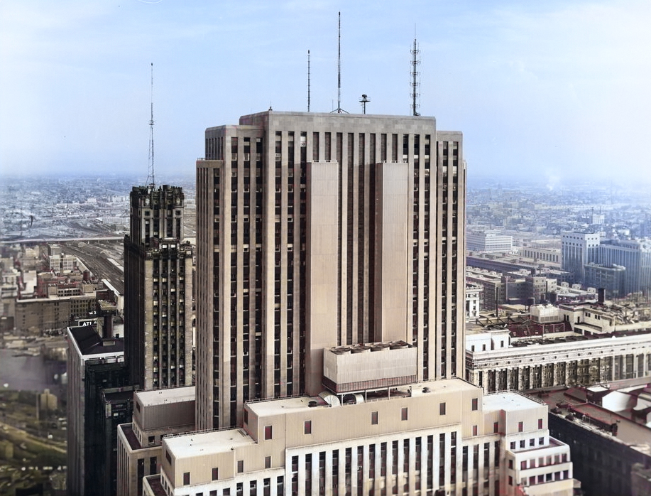
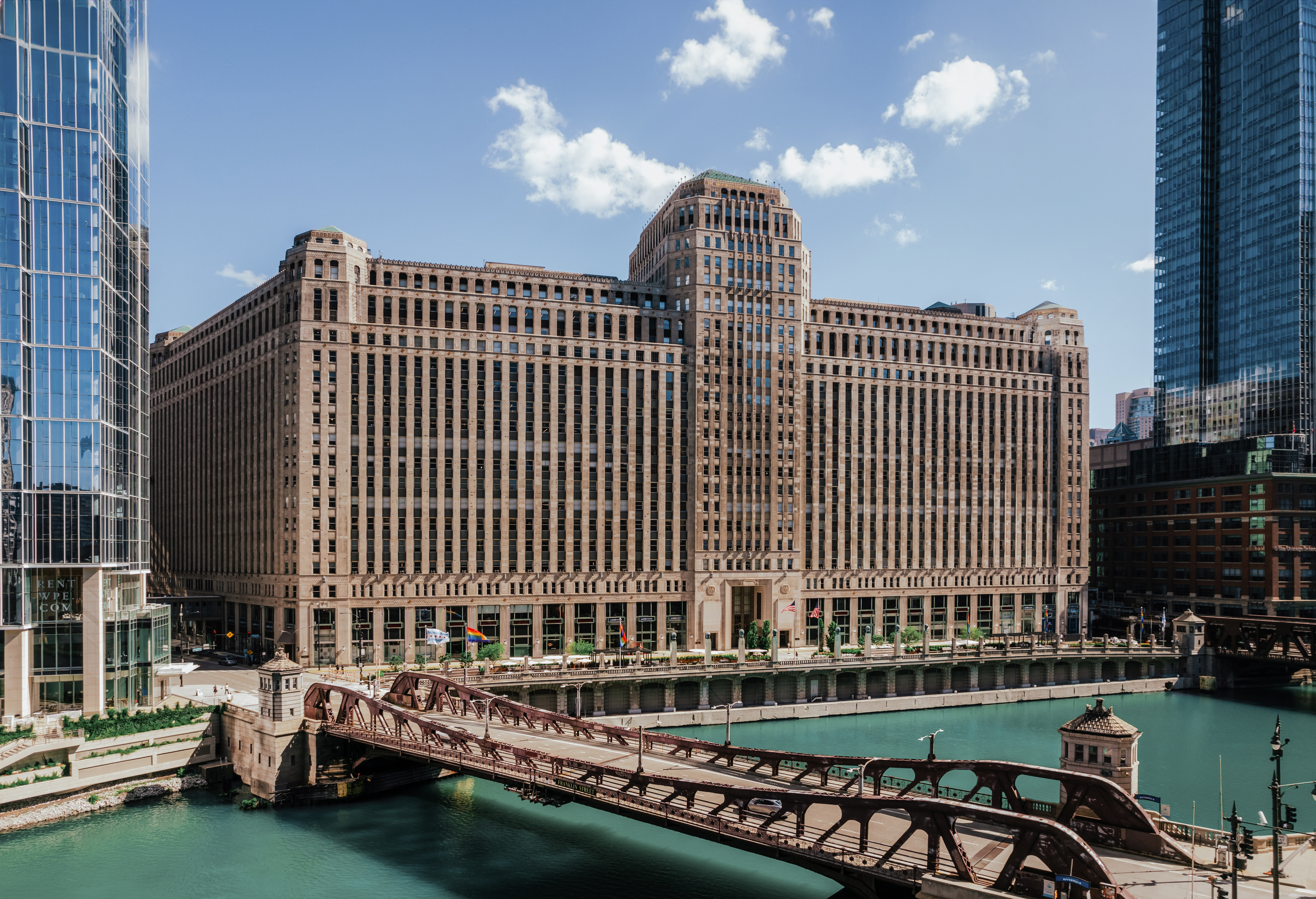
The Merchandise Mart is an Art-deco skyscraper designed by Graham, Anderson, Probst & White, and built between 1928 and 1930 in Chicago, IL.

Merchandise Mart is not the only name you might know this building by though. It is common for companies to want to attach their names to iconic buildings when they move in, or for the general public to come up with nicknames, and this one is no exception. The Merchandise Mart is also known, or has been known as, Merch Mart, or Mart.

Its precise street address is 222 Merchandise Mart Plaza, Chicago, IL. You can also find it on the map here.

The building has been restored 4 times over the years to ensure its conservation and adaptation to the pass of time. The main restoration works happened in 1950, 1960, 1977 and 1988.
Building's timeline

Construction begins
1928
96
Construction completed
1930
94
Restoration
1950
74
Restoration
1960
64
Restoration
1977
47
Restoration
1988
36
years ago
2024

Architect and team

Graham, Anderson, Probst & White was the architecture firm in charge of the architectural design.

Also known as GAP&W, the firm was founded in 1912 in Chicago, and remained active until 2006, when it finally closed its doors.

GAP&W is not only key in the evolution of Chicago's architecture because of the buildings they designed, which were many and nothing short of cutting-edge for their time, but also because two of their architects, Hubert Burnham and Daniel Burnham, eventually started their own practice, which became Burnham Brothers, yet another of the most influential firms the city has ever seen.

The firm's style evolved according to the times. Their first buildings had clear Beaux-Arts inspirations, but they eventually embraced the arrival of Art-Deco, as well as neogothic and neoclassicism.

That being said, architecture is a complex discipline involving many professionals from different fields, without whom this building would have not been possible. We will surely be leaving out a lot of names here, but here is a list of the people we do know also played their part in making the Merchandise Mart a reality:

  • John W. Griffiths & Sons as the Main Contractor
  • Marshall Field & Co as the Main Developer

Architectural Style

The Merchandise Mart can be categorized as an Art-deco building.

The Art Deco movement flourished during the 1920s and 1930s, with many historians marking the outbreak of World War II as its final decline. Even though a couple of decades might not seem as much, the Art Deco movement had a great impact on architecture, and it's widely represented in many American cities due to the development boom that happened during that time.

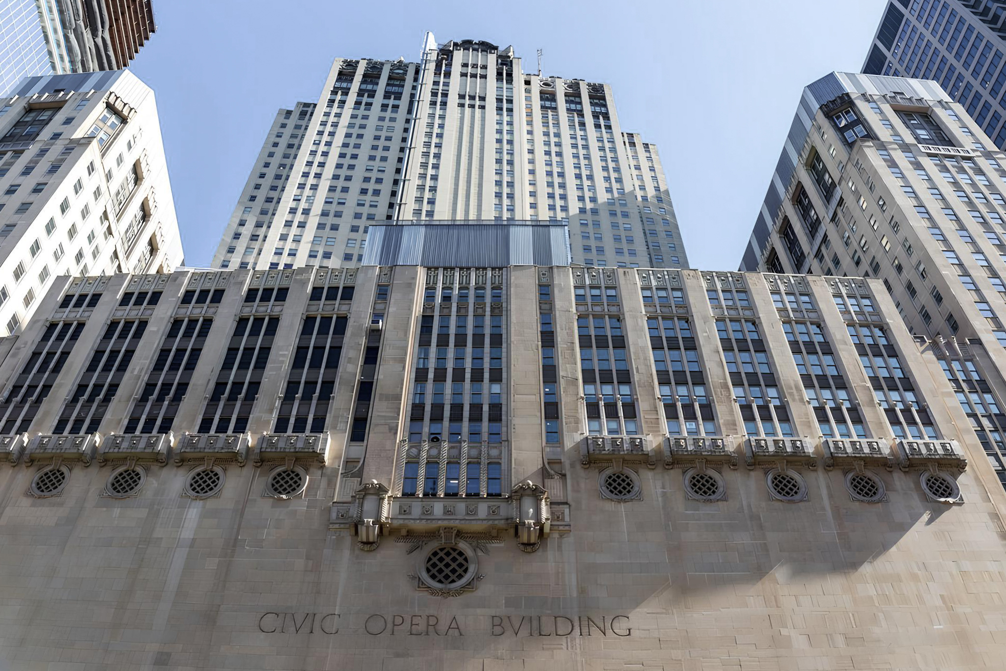
Art Deco marked the abandonment of traditional historicism and the embracement of modern living and the age of the machine. In architecture, that meant leaving behind the ornaments of Beux-Arts and Neo-Gothic buildings and instead favoring simplicity and visual impact through geometric shapes, clean lines, and symmetrical designs. Ornaments were still an important part of the design, but they became bold and lavish, and were often inspired by ancient cultures or industrial imagery, instead of nature.

The Merchandise Mart was completed in 1930, right when the Art Deco movement was at its peak, so it kind of went with the trend at that time.

Spaces & Uses

The Merchandise Mart reaches an architectural height of 341ft (104m). It has a total of 25 floors, which combined offer a total of 4,004,171 sqf (372,000m2) of usable space.

Ever since opening its doors to the public in 1930, the Merchandise Mart has mainly been used as Commercial space, with other complementary uses such as .

341ft (104m)

Materials & Structure

The Merchandise Mart uses a frame structure made of steel columns and concrete slabs.

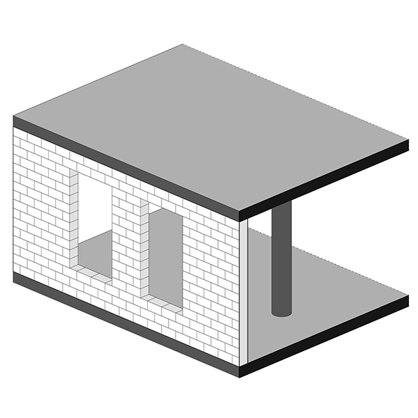
A frame structure uses a combination of beams and columns to sustain the building's weight. The walls in this case are non-load bearing, which allows for more flexibility when distributing the interior spaces.

The facade is a non-load bearing masonry facade. This type of facade became common during the period when buildings, especially taller ones, transitioned from load-bearing wall systems to frame structures.

Frame structures allowed facades to be independent from the building's frame, enabling the use of lighter materials and larger openings. However, it took some time for architects to incorporate these new posibilities into their designs, and so for a while they simply replicated the look and feel fo buildings people where used to seeing.

Non-structural Masonry Facade

From an aesthetic point of view, the facade features limestone, terracotta and bronze.