AT&T Building

Att Building
  1. About the AT&T Building in Nashville
  2. Architect and team
  3. Architectural style
  4. Spaces and uses
  5. Structure and materials

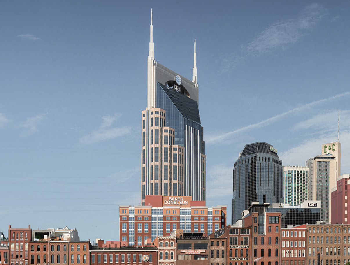
The AT&T Building is a Postmodernist skyscraper designed by Earl Swensson Associates, and built between 1991 and 1994, for a reported $94.0 million dollars, in Nashville, TN.

AT&T Building is not the only name you might know this building by though. It is common for companies to want to attach their names to iconic buildings when they move in, or for the general public to come up with nicknames, and this one is no exception. The building has changed names several times over the years, and is also known as:

  • Batman Building.
  • BellSouth Building.
  • South Central Bell Headquarters between 1994 and 2007.

Its precise street address is 333 Commerce Street, Nashville, TN. You can also find it on the map here.
Building's timeline

Construction begins
1991
33
South Central Bell Headquarters
1994
30
years ago
2024

Architect and team

Earl Swensson Associates was the architecture firm in charge of the architectural design.

That being said, architecture is a complex discipline involving many professionals from different fields, without whom this building would have not been possible. We will surely be leaving out a lot of names here, but here is a list of the people we do know also played their part in making the AT&T Building a reality:

  • Stanley D. Lindsey & Associates, Ltd. in charge of Structural Engineering
  • Brasfield & Gorrie, and Ray Bell Construction as the Main Contractor
  • The Mathews Company as the Main Developer
  • Earl Swensson in charge of Interior Design

Architectural Style

The AT&T Building can be categorized as a Postmodernist building.

Postmodernism in architecture emerged in the United States during the late 1960s as a reaction against the starkness of the International Style, which part of the new generation of architects argued was too impersonal, sterile, and disconnected from historical and cultural contexts.

Postmodernism challenged the International Style's austerity by reintroducing historical elements and ornamentation, although this time not as literally as in the Neo-Classic buildings. Instead, they reinterpreted them within the context of modern materials and construction techniques.

Postmodern buildings often feature bold, contrasting colors, unconventional forms, and a playful blend of various architectural elements from different eras and cultures.

In the United States, Postmodernism was not just an aesthetic choice but also a philosophical stance. It represented a democratization of design, where architects sought to create buildings that were accessible and meaningful to a broader range of people, not just designers and intellectuals.

The AT&T Building was completed in 1994. By 1994 the Postmodernism movement was experiencing a transition. Critics argued that Postmodernism, initially a rebellious and innovative style, had become formulaic and commercialized, and so the trend started moving away from blending historical styles, irony, and playful ornamentation, and begun to give way to emerging architectural trends concerned with more present matters such as technology, ecology or sustainability.

The AT&T Building was kind of late to Postmodernist movement, which in some ways might make it seem older than it really is.

Spaces & Uses

The AT&T Building reaches an architectural height of 453ft (138m), 617ft (188m) if you count the antenna. It has a total of 42 floors, 33 above ground and 9 basements.

The building sits on a 118,403 sqf (11,000m2) piece of land , and offers a total of 1,001,043 sqf (93,000m2) of usable space.

In regards to parking space, the building has a total of 1308 spots available, which roughly equals 40 spots per floor (above ground), or one parking spot per every 764 sqf (71m2) of usable space.

Ever since opening its doors to the public in 1994, the AT&T Building has mainly been used as Commercial space.

617ft (188m)
453ft (138m)
9 basements

Materials & Structure

The AT&T Building uses a frame structure made of concrete columns and concrete slabs.

A frame structure uses a combination of beams and columns to sustain the building's weight. The walls in this case are non-load bearing, which allows for more flexibility when distributing the interior spaces.

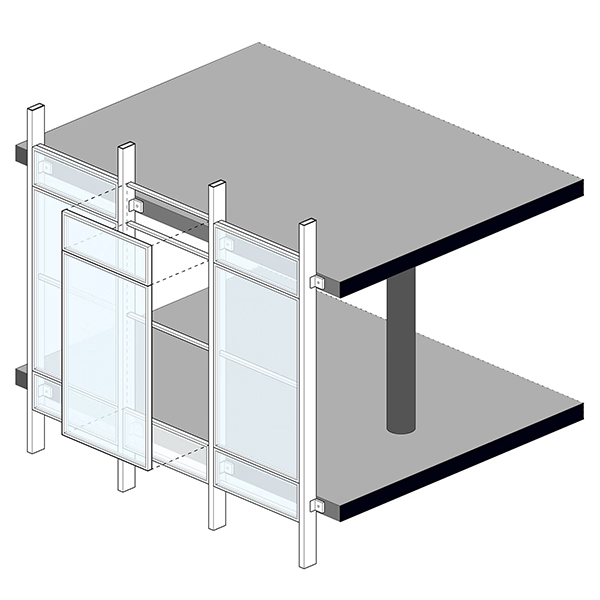
The facade uses a non-load bearing curtain wall system. This means the curtain wall modules are anchored to the building's structural frame, typically by being attached to the edge of the floor slabs. The curtain wall system connects to the slabs using brackets, anchors, and mullions, which transfer the loads imposed by wind and temperature changes, to the building's primary structural elements.

This setup allows the curtain wall to accommodate differential movement between the facade and the structural frame, such as thermal expansion, floor deflection, or sway from wind forces. This system's integration with the slab edges also allows for continuous insulation and weatherproofing layers.

Non-structural Curtain Wall Facade

From an aesthetic point of view, the facade features a red granite podium that gives the building a solid and robust appearance. Above this, the central body of the building rises with a dark-glass curtain wall with vertical, light-colored mullions, which emphasize the verticality of the building. The curtain wall then leans inward towards the center at the top, creating the building's unique silhouette. This central section is flanked by three lateral sections on each side, arranged in a scale from smaller to larger as they rise. These sections appear to be more "solid", as they feature some granite cladding instead of pure glass, and are topped by the building's 2 recognizable spires, which are then connected over the central body by a stepped pediment in a light color, with an arch at the center.

Sources

  • www.wkrn.com
  • en.wikipedia.org
  • web.archive.org
  • eu.tennessean.com
  • esarch.com
  • www.energystar.gov