One Grand Central Place

One Grand Central Place
  1. About the One Grand Central Place in New York
  2. Architect and team
  3. Architectural style
  4. Spaces and uses
  5. Structure and materials

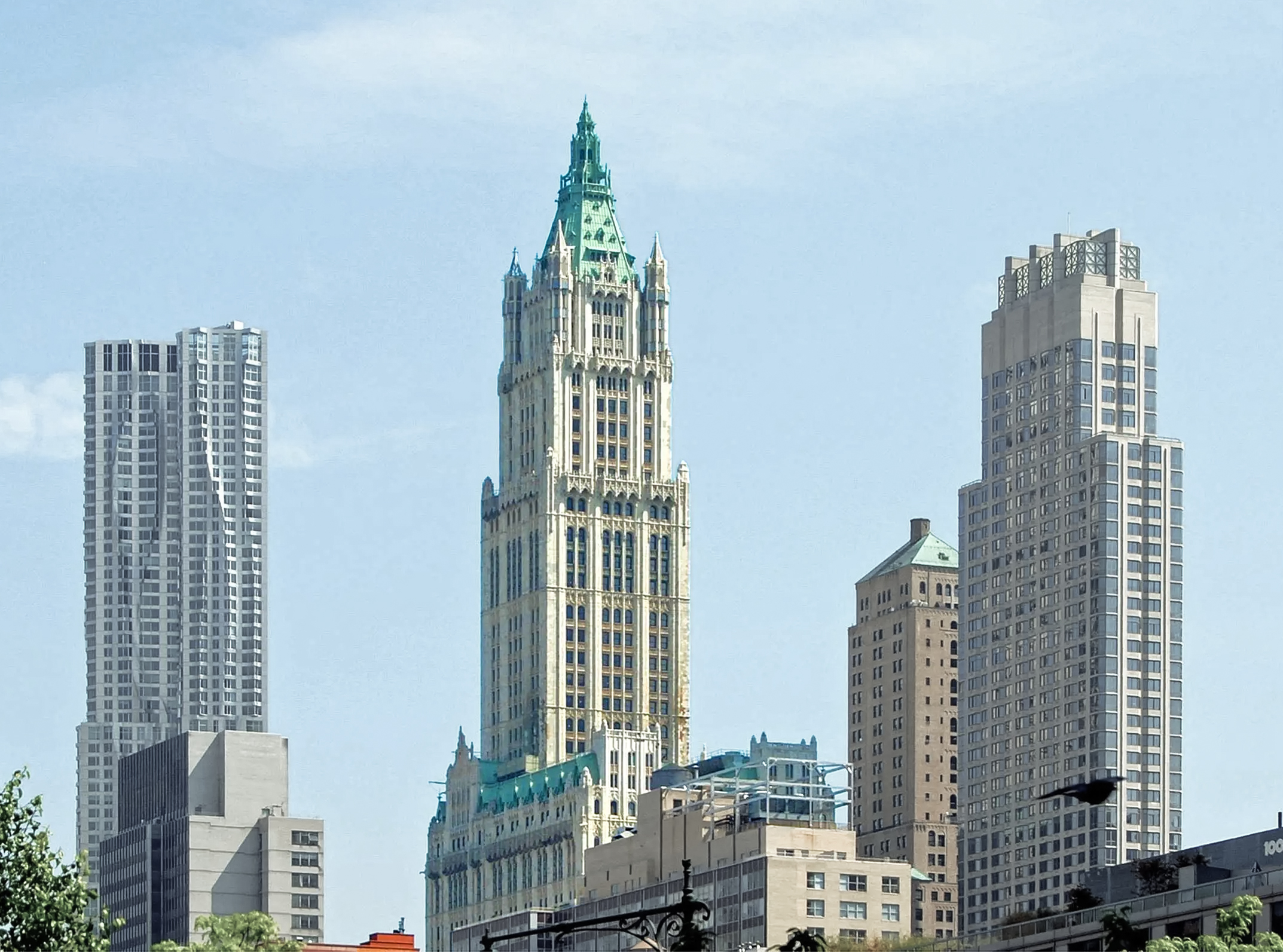
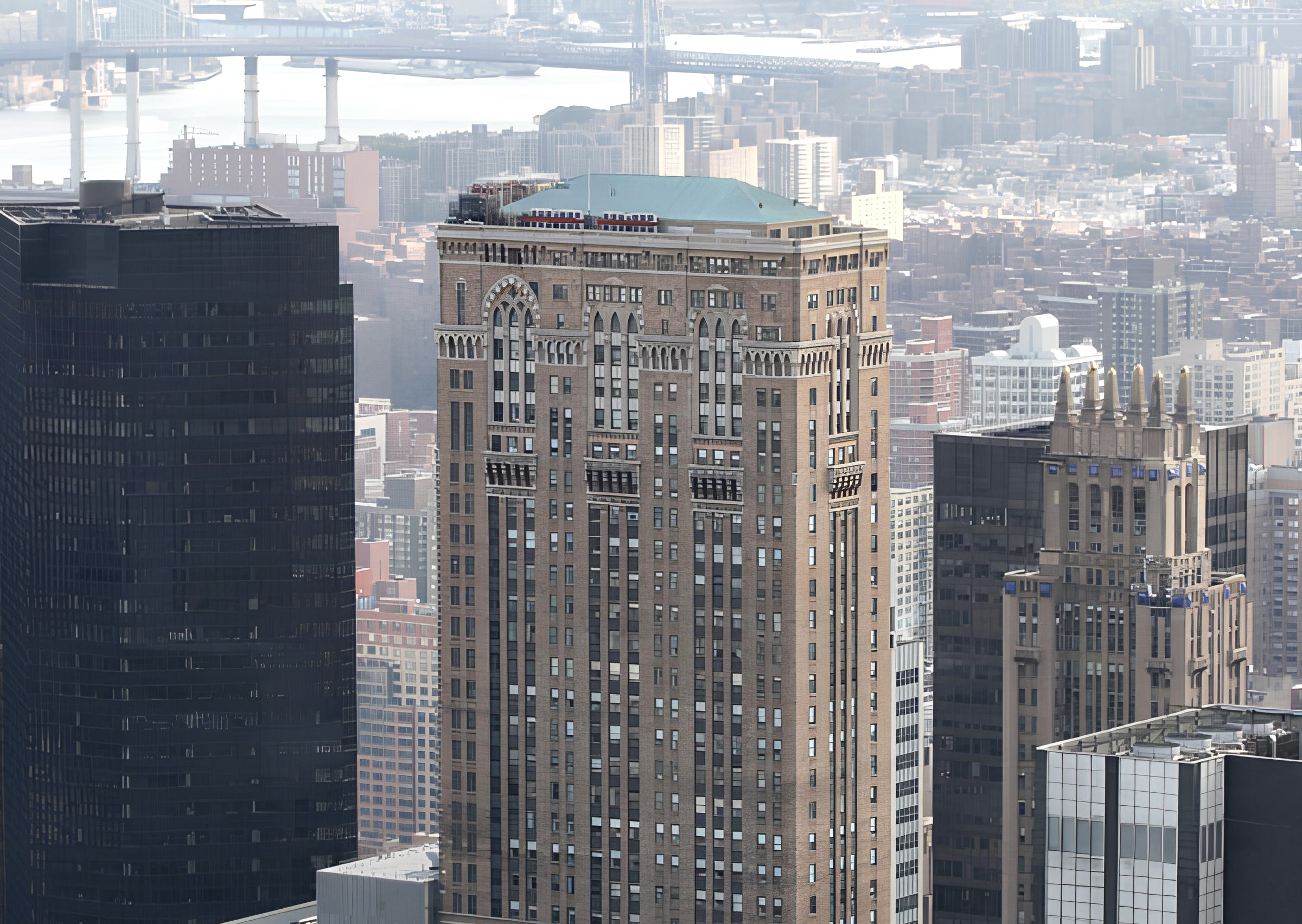
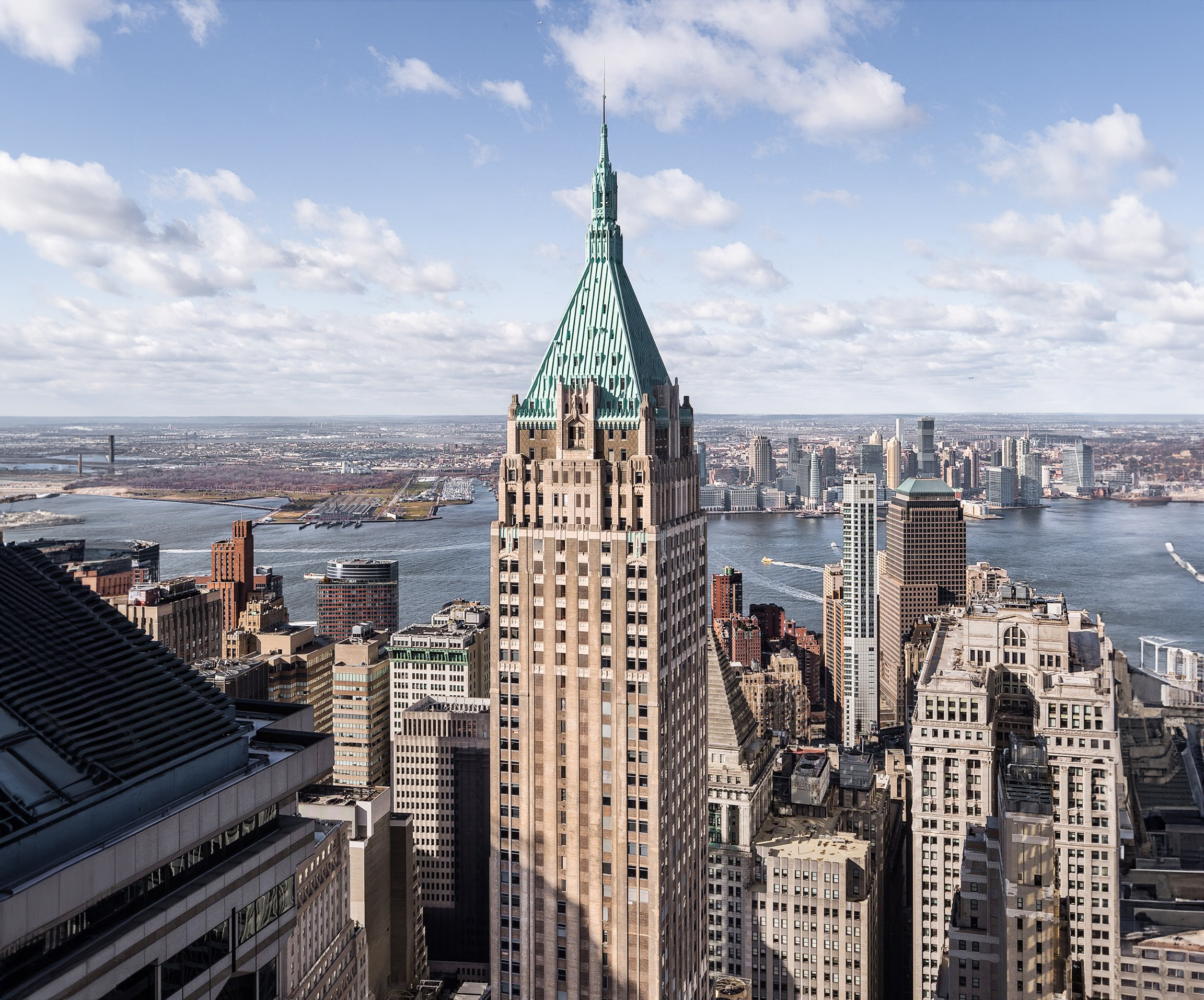
The One Grand Central Place is a Neogothic skyscraper designed by J.E.R. Carpenter, with Kenneth Norton as lead architect, and built in 1930 in New York, NY.

One Grand Central Place is not the only name you might know this building by though. Between 1930 and 2009 it was also known as Lincoln Building.

Its precise street address is 60 East 42nd Street, New York, NY. You can also find it on the map here.

The building has direct access to Grand Central Terminal from its north side, and as of 2019, it's one of 41 Manhattan buildings with its own zip code, 10165.

The building underwent a major restoration between 2005 and 2009. The architect commissioned to undertake this restoration was CANY.
Building's timeline

Construction completed
1930
94
a
Restoration
2009
15
years ago
2024
  1. 2005 to 2009 - The enhancement and upgrade program included the lobby and significant improvements throughout the building, such as the installation of new windows, modernized elevators, and upgraded mechanical systems. This also includes comprehensive updates to the electrical, plumbing, and HVAC systems to enhance efficiency and comfort building-wide. The total cost of the intervention was $85 million USD. The architect in charge was CANY.

Architect and team

J.E.R. Carpenter, with Kenneth Norton as the lead architect, was the architecture firm in charge of the architectural design. But there was also one other architect involved, as far as we know. We are talking about William Harmon Beers.

That being said, architecture is a complex discipline involving many professionals from different fields, without whom this building would have not been possible. We will surely be leaving out a lot of names here, but here is a list of the people we do know also played their part in making the One Grand Central Place a reality:

  • Lincoln Storage Company, and Lincoln National Bank as the Main Developer
  • Daniel Chester French as the collaborating Artist

Architectural Style

The One Grand Central Place can be categorized as a Neogothic building.

The Neo-Gothic style, also known as Gothic Revival, emerged in the United States during the late 19th century, taking inspiration from the Gothic architecture found in Europe from centuries prior.

The Gothic Revival movement took elements characteristic of the Gothic buildings, such as pointed architect, ribbed vaults and flying buttresses, and applied them to newer buildings, even those belonging to typologies that did not exist during the original Gothic period, such as skyscrapers.

Neg-Gothic buildings usually feature pinnacles, gargoyles and other decorative elements that emphasize the verticality of the structure, and include stonework that features the craftsmanship of skilled artisans of the time.

The One Grand Central Place was completed in 1930. These were the late days of the Neogothic movement, which had been around for almost 200 years at the time.

Art-deco would soon take over US architecture, and therefore, even though J.E.R. Carpenter didn't venture into what was cutting edge in terms of style at the time, and took instead a more conservative approach to the design of the One Grand Central Place, it is possible that the design already started showing some traits that would later become characteristic of the art-deco movement.

Spaces & Uses

The One Grand Central Place reaches an architectural height of 673ft (205m). It has a total of 55 floors, served by 29 elevators, which combined offer a total of 1,241,228 sqf (115,314m2) of usable space.

Ever since opening its doors to the public in 1930, the One Grand Central Place has mainly been used as Commercial space.

673ft (205m)

Materials & Structure

The One Grand Central Place uses a frame structure made of steel columns and concrete slabs.

A frame structure uses a combination of beams and columns to sustain the building's weight. The walls in this case are non-load bearing, which allows for more flexibility when distributing the interior spaces.

The facade of the building however, is load bearing. This doesn't imply that it is a traditional load-bearing wall. Rather, it means that the structure's exterior pillars have been pushed to the very edges, becoming integrated with the facade, and therefore, technically, a part of it.

It is a side-core office building, meaning that the elevators, stairwells, and mechanical systems are all situated on one side of the structure.

From an aesthetic point of view, the facade features a 4 story base clad in marble, followed by two transition floors clad in limestone. The rest of the building's facade is made of brick, and organized in narrow bays, with retracted windows and ornate terracotta spandrels.

The facade's design also features other ornamentations, such as multiple cornices at various levels, most of which happen at key levels, such as those featuring setbacks and terraces.

Towards the top of the building, the design incorporates Gothic-inspired pointed arches, and a large arcade on the upper floors.

Sources

  • en.wikipedia.org
  • marketplace.vts.com
  • www.esrtreit.com
  • www.cany.com
  • www.nycurbanism.com
  • structurae.net
  • rentnyoffice.com
  • wikimapia.org